 Work
Work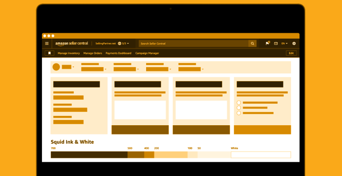
I am a Principal UX Designer in Amazon's Seller Partner Services (SPS) org. I am currently employed at Amazon, and some or all of my projects may not have launched (yet). The images and information below are a limited preview of that work.
Navigation
My first project at Amazon was to oversee the evolution of the navigation UX for Seller Central. A revised UI was important – our current navigation was limiting our ability to create more and better-defined top-level categories, so I designed a strategy to deliver incremental change via themed milestones. These would be accessible via an opt-in beta to allow users to try the new UI in a low-stress, low-stakes environment.
Results
15
months in beta
3
A/B tests
10+
UX research studies
1
Unprompted ‘Thank You’ thread
My first project at Amazon was to oversee the evolution of the navigation UX for Seller Central. A revised UI was important – our current navigation was limiting our ability to create more and better-defined top-level categories, so I designed a strategy to deliver incremental change via themed milestones. These would be accessible via an opt-in beta to allow users to try the new UI in a low-stress, low-stakes environment.
During the beta period, we launch our second milestone: a customizable favorites bar. This allows us to sidestep efficiency impacts from placing the navigation menu in a hamburger menu, as well as the problematic cases triggered by allowing personalization of the global nav itself. When the beta period ended, over 90% of the users who were positive on the redesign referenced this feature as a favorite.
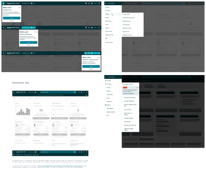
I also introduced new rubrics and processes for assessing navigation requests. Two major wins included the creation of a Learn nav menu, which increased traffic to valuable content for new users (+53% vs. control), and the re-organization of the Catalog and Inventory menus to eliminate duplication and better align our menus to our user's mental model, resulting in increased usage of all items in both menus.
Design System
Katal Design System is focused on providing for the unique needs of sellers, vendors, and other business users on Amazon. When I took over this project, the visual design had been lead by a team of designers who were separated from the development team, with divergent asset libraries, competing documentation sites, and a fractured relationship.
Results
1
team merger
2
library rebuilds
40+
refreshed components
10+
new foundations, components, and patterns
Katal Design System is focused on providing for the unique needs of sellers, vendors, and other business users on Amazon. When I took over this project, the visual design had been lead by a team of designers who were separated from the development team, with divergent asset libraries, competing documentation sites, and a fractured relationship.
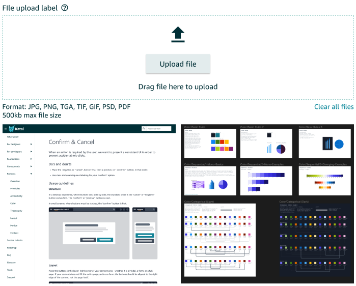
I created a team and processes to rebuild our Sketch library to match the coded components and better support resizing, nested symbols, and content overrides - improving the utility for designers and developers. I also created a new intake process and began working with the development team to build better co-working habits to repair the relationship so that the design system itself could move forward. Eventually, we would rewrite all of the documentation and create a single documentation site for our design system and other tools, and rebuild our library a second time to add Figma support.
Our design system has also grown significantly – adding more than 10 foundations, components, and patterns in the first year, as well as cataloging and addressing our backlog requests and UX debt.
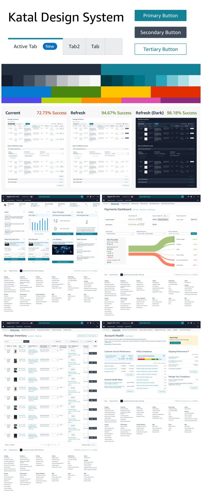
Currently, we're preparing for a complete visual refresh. Every foundation has been redesign to adhere to Amazon's update brand standards, in addition to make the system easier to use, more flexible, and more user-friendly for our end-users. We've expanded our type ramp and detached them from HTML tags, created a more predictable layout grid, and created a structured palette of color families that replaced confusingly named colors like Nordic, Tarpon, Submarine, Athens, Seattle, and Snow. I'm also solving for usability problems. Today, users can correctly distinguish active and disabled buttons less than 75% of the time – our redesign improves this to 98%.
Looking forward, I am involved in our annual planning and 3 year architecture plan to shape our future and create more tools to amplify designer and developer velocity, raise the quality of our UI, and measure the health and impact of our design choice.