Results
60%
Recommendation revenue increase
Positive
Site-wide revenue increase
20ms
Response time reduced
8X
Increase in coverage between V1 and V2
Overview
One of eBay's biggest challenges was converting browsers into buyers. With eBay's massive inventory selection and (at the time) free-form catalog, it's easy for shoppers who don't have a specific item in mind to fall into an endless loop of searches until they abandon their mission. The Merchandising team reduced this with a recommendation system that would provided exploration paths – because sometimes, you know which type of soccer cleats you want, but you need help finding the perfectly garish colorway.
The Work
01.
The Problem
eBay never really knows why a user clicks on an item.
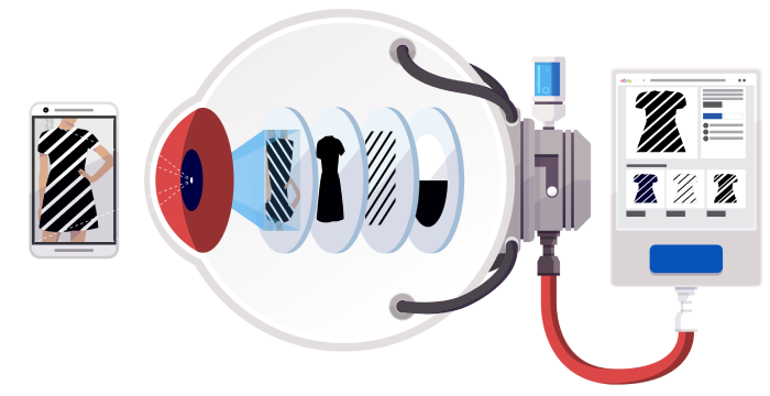
In can be inferred based on filters and search terms, but at the end of the day, eBay doesn’t know if, in my example, I searched for Adidas because I love their shoes, or because it’s the first brand I thought of. I hypothesized this would be a place to experiment with discovery recommendations: look at the top aspects of an item (brand, color, style, etc) and generate recommendations for the variations in those key aspects. Even if the recommended items aren't a perfect match, they can at least help direct the user's next search.
02.
Version One
In can be inferred based on filters and search terms, but at the end of the day, eBay doesn’t know if, in my example, I searched for Adidas because I love their shoes, or because it’s the first brand I thought of. I hypothesized this would be a place to experiment with discovery recommendations: look at the top aspects of an item (brand, color, style, etc) and generate recommendations for the variations in those key aspects. Even if the recommended items aren't a perfect match, they can at least help direct the user's next search.
In the actual experience, the data wasn't as reliable as we hoped. The un-optimized data set often lacked aspects, leading to the algorithm not providing any recommendations. In categories where this data did exist, we saw good results, providing hope for future iteration.
03.
Version Two
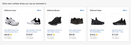
For our second attempt, we wanted to ensure we'd have a more complete results set. As structured data became more reliable, we built an algorithm from scratch that reflected a new strategy - focusing on the variety in key aspects, as determined by the algorithm, the user's original search, and the item itself.
For example, if you’re looking at black Nike running shoes, we would show suggestions for different brands of black running shoes or different colors of Nike running shoes. In this test, not only were people buying directly from the placement, but they were finding the right item more often in general.
04.
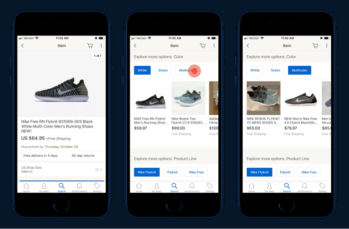
Mobile Launch
The next step was to provide more options - not just a mixed list of brands or colors, but to actually group them into meaningful sets. We started with our native mobile apps, where we were limited to large, stacked grids for our recommendations product. Once we showed that carousels were a viable UI for our existing recommendations when inserted at a user's decision points, we began exploring ways to enable exploration.
Our first prototype showed 1 or 2 carousels per aspect, with the additional recommendations triggered by the user to enable an infinite browse experience. Unfortunately, this didn’t go far - in development, it turned out to be too slow, too clunky, and too memory intensive and made the experience of using the app worse.
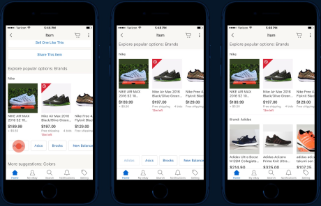
Eventually we settled on using the buttons as mini-tabs to switch out the recommendation sets. This launch produced a boost in performance and engagement similar to the desktop launch.