 Work
Work
Results
30+
new components and patterns
30%
Improvement in usability
5
deprecated components
3
library rebuilds
1
visual refresh
Lots
of ad-hoc teams
Overview
Katal Design System (KDS) supports Amazon’s third-party seller and business-management tools. When I joined the team, it was already established but languishing due to disconnects between design and engineering and a lack of clear direction. Over the next five years, I partnered with product and engineering to turn KDS into a unified, living design system that delivered measurable value.
The Work
01.
The Problem
Usage of the design system was mandated for all new products, but I wanted to make KDS a design system people would want to use. That meant reconnecting designers and developers, making the system as it existing usage, and starting the processes that would evolve KDS into a modern, full-stack design system.
02.
Earn Trust
I started by building trust—especially with the design system’s developers—based on three principles:
Code is Truth
Developers were co-owners, not just implementers. I worked to align design assets with code (or file bugs for obvious issues), and advocated for shared documentation.
Be the Example
In our first meeting, I asked the team to agree we were all good at our jobs, even if we disagreed over specifics. Over time, disagreements became discussions and opportunities to teach each other.
Set Common Goals
We agreed that “KDS should be better tomorrow than today,” although what “better” meant was up for debate. I worked with product and engineering leads on a shared short-term roadmap to align priorities and prevent burnout and distrust, and became the design system’s advocate in annual planning.
03.
Evolve the system
Component and Pattern Intake Processes
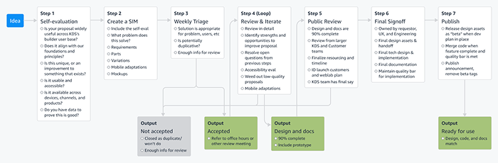
The first challenge was to restart the intake process for components and patterns. We began with a framework based on past lessons. To begin, we created the skeleton of a contribution processes, looking at successes and failures from the past, then stress-tested it with components long requested by builders. The process emphasized low-fidelity exploration, open feedback mechanisms, internal stress testing, and usability validation before finalization.
We ultimately created over 20 components with some variation of this process, including these notable successes:
Navigation
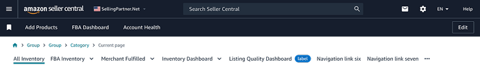
This component standardized navigation within Seller Central products, which originally all used custom, diverging UIs.
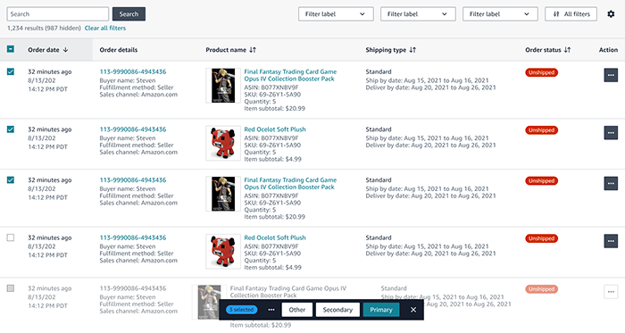
Data Grid
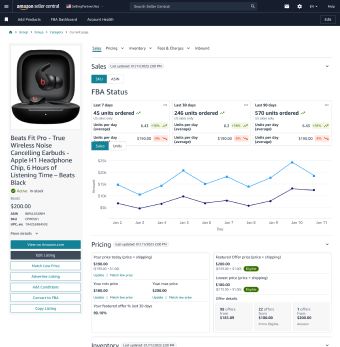
The most complex component was our Data Grid, which would standardize the display, sorting, and filtering of data in our notoriously complex tables. I worked with a small team of designers and developer partners to gather requirements and build a coherent set of guidelines and behaviors before designing the components. Particular attention was paid to “advanced” functionality, like multi-item select and actions. Given the time and complexity involved, this went through multiple rounds of revisions, including a prolonged beta and A/B testing in live apps before the full launch.
Visual Refresh
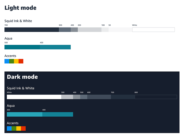
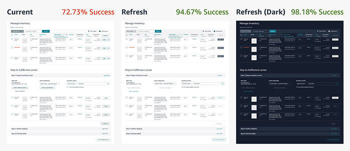
KDS's visual design looked dated and created problems for builders and end-users. For example, colors relied on vague names like 'Nordic' rather than semantic names like 'primary text'. This led to inconsistent usage, confusing new users and reducing clarity—only 73% of users could identify active UI elements correctly.
We introduced:
- New color ramps with semantic tokens for components
- Visual rules for implementing custom components
- A new typography scale independent of HTML tags
We tested these changes both in abstract rule-based exercises for builders, as well as stress testing the actual components with current and upcoming products to ensure we weren't working ourselves into corners.
Our rollout included a 6-phase A/B test plan to track impact. Though the refresh didn't directly raise financial metrics, usability improved: users correctly identified active elements 95% of the time in light mode and 98% in dark mode (up from 73%). This led to more feature adoption and higher engagement, and ultimately allowed us to launch without requiring updates from our end-users.
This also allowed us to partner with a team to provide extended design support for data visualization, including predefined, accessible visualization palettes and a full set of charts

Mobile Web & Dark Mode
Following the visual refresh, we finalized dark mode and optimized components for mobile use, especially within webviews in native apps. We aligned design tokens across platforms to support future unification, and ensured all non-table components were fully usable on mobile devices.
The first major result was a revamped product listing workflow that was faster, more robust, drove significant improvements in financial and behavioral metrics, and most importantly was well-received by users.
Blueprints
My final project aimed to streamline front-end app creation. While backend automation tools existed, front-ends were still unique and built from scratch.
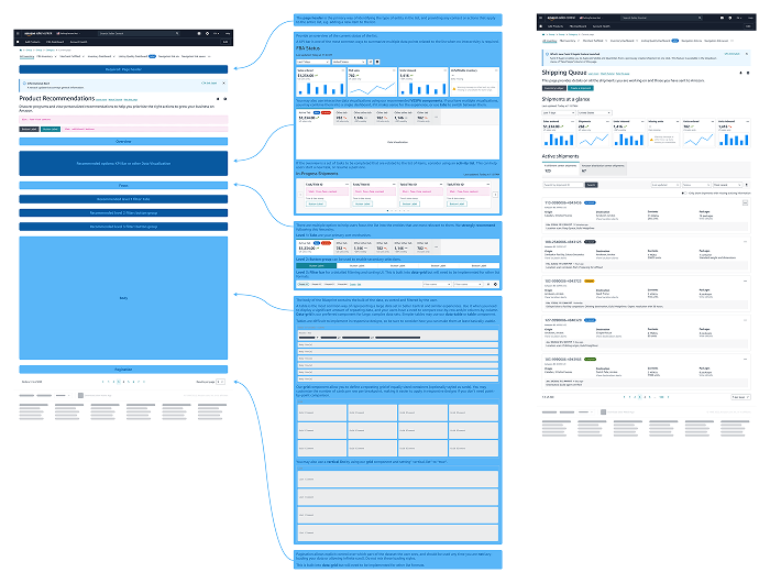
We first explored a low-code prototype builder but pivoted to standardized page archetypes (e.g., entity list, dashboard, detail pages). Each Blueprint starts with the generic page shell, and is populated with components and content based on archetypes like entity list, entity detail, and dashboard. In the future, developers could use a CLI or LLM prompt to generate a complete page with basic APIs, tracking, and measurement.
By the end of 2024, we launched five blueprint pages to beta customers. Early feedback revealed our documentation lacked clarity on which elements were fixed vs. flexible, so I revised the docs and Figma assets accordingly before the year ended.