Design Process & Tools
Process
I'm a process skeptic. It's not that the idea of having a process is a problem – it's that they're often presented as the “one true solution” to be applied in every situation. That's unrealistic - what works for me in my current role at Amazon is not necessarily appropriate for the UX team at a small startup. My process is something that's grown out of my time at large companies like eBay, Indeed, and Amazon where the UX role is engaged throughout the entire design cycle. It's changed over the years, and will change in the future. In general, our processes should be as agile as possible and open to iteration and change, not a limitation on how we work.
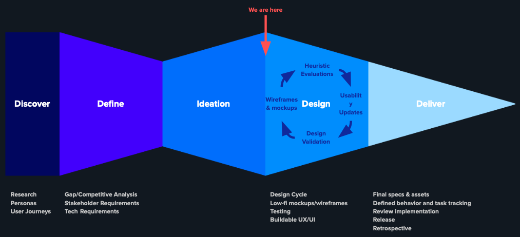
The product design processes extends beyond the GV Design Sprint process, or the Stanford D-School “Design Thinking” process. I have my issues with those process, but at their heart, they're simply incomplete. They are addressing a very small part of the product creation and UX design cycle, and leave out much of the un-sexy hard parts. Damien Newman's design squiggle is great for a quick illustration, but oversimplifies things and is still a linear process. The line is just a bit messy. The double diamond/dart model, show below, adds detail and makes it clear that there's room for iteration. It's not perfect either though – it never makes it explicit that we should step away from our work from time to time, evaluate it, and find opportunities to branch off into new directions.

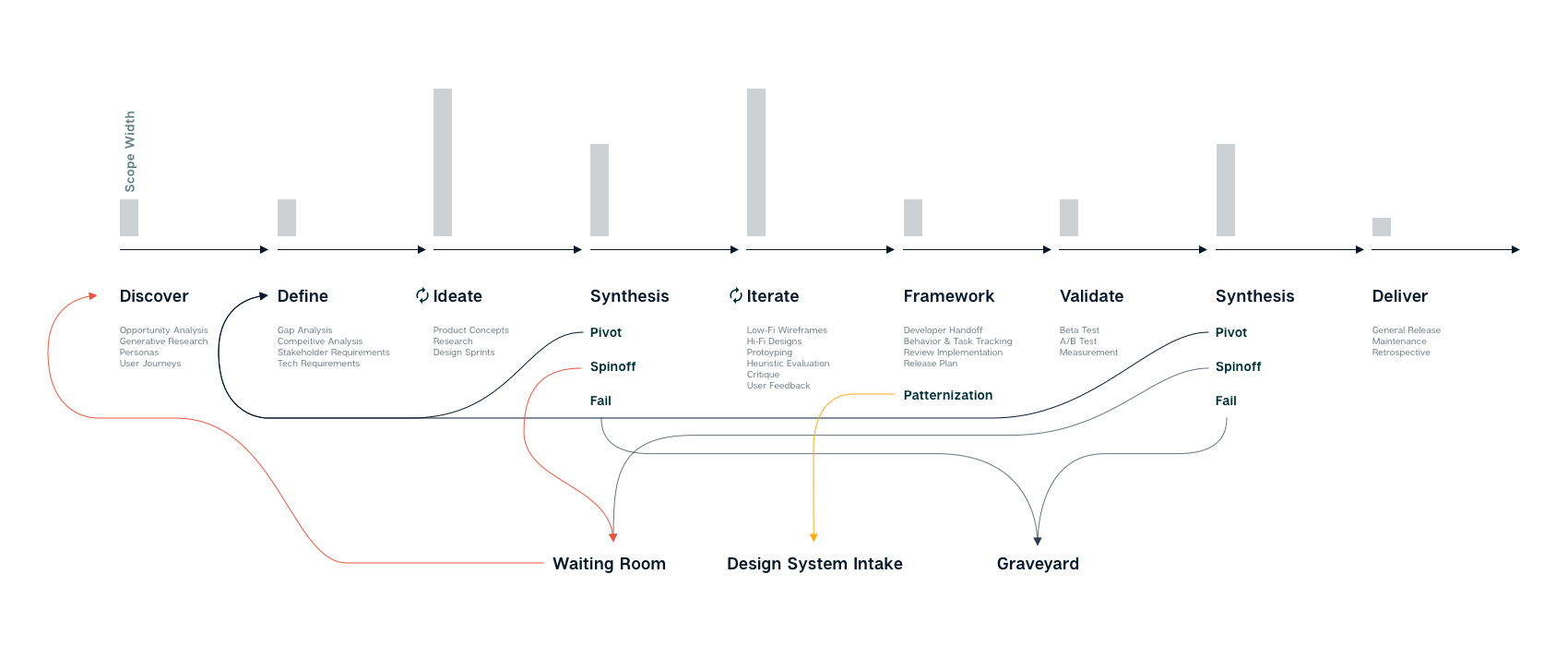
The process, as I currently define it, adds a few extra steps to account for how I actually work at Amazon. I feel that this meets my needs in terms of balancing incremental and iterative work, as well as ensuring that we're feeding back into our design systems.
The first major change from many design systems is that I include synthesis as an explicit step. This is the real area designers need to excel in. At key points, I look to put the work aside for a day or two and pick up other work. I'll write documents, switch projects, review other designers' work, or do some self-driven skill growth – anything but immediately move to the next step. There's something about letting the subconscious mind stew on a subject, then coming back with fresh eyes. Do you need to pivot and change the problem or goal? Does some of this need to die? That's ok. Give it a tasteful sendoff, and be done with it. Did we find something interesting for future iteration? Flag it, and save it for later. We move on with the rest.
Second, I break tasks commonly grouped under “Delivery” into 3 steps: Framework, Validation, and Delivery. Framework is about the formalization of the work we've done, whether you're making it pixel perfect, creating specs for developers, or anything else. I also take time here to consider patternization and how my work will feed back into the larger product ecosystem. This is critical at Amazon where my product team manages only a very small slice of the Seller & Vendor experience, and needs to communicate out to the larger organization, including potentially changing the design system. Validation is focused on measuring our launch. Deliver is our final step. After a second round of synthesis (critical after you have actual data to analyze) the focus shifts to long-term support. Maintenance and iteration never end, but we should stop and have a retrospective – take stock of the projects successes and failures, and consider what should change the next time.
A few things to note about the successful implementation of any process:
The pre-work planning is critical. For a designer apply a process to their work critically, it's important that they are able to have a predictable workload. It doesn't really matter how you do this. My preference is, regardless of how far in advance your roadmap looks, to regularly make sure that our highest priorities are still our highest priorities. Let's say your work is planned on quarterly roadmaps - 12 weeks at a time. 2 or 3 times during this cycle, regardless of your sprint schedule, you need to make sure that P1s are still P1s, and that your partners are still on board with any work they need to share. It doesn't need to be a major backlog scrub or a huge production – just perform a sanity check.
Speaking of sprints and agile processes, I prefer a minimal process in this regard. For example, I don't think obsessing over time tracking is useful. Track just enough to know if you're estimating work correctly more often than not (and if not, why). Better estimation will reduce late nights and churn, which leads to happier and healthier teams.
Not every project requires you to step through every part of the process. It's certainly ideal that each project starts with the opportunity to redo discovery work, but it's more important that relevant discovery work has been done recently. If that work is relevant, re-use it. Also, sometimes, you're just not equipped to validate the problem. If you're handed a task by stakeholders who are already convince they've defined the problem correctly, it may be a better use of your time to focus on defining the goals, users, scenarios and tasks before challenging assumptions.
Tools
There are a lot of tools out there. Let's talk about them, and why I use (or don't use) some of them.
Personas
Personas are one of the key tools in most Discover phases. They start from a good idea: that we can create a pseudo-user, who is an amalgamation of common attributes and needs. They can act as a placeholder for users in the decision making process. And yet, too often they're not based on research or they're padded out with irrelevant data. For example, does your persona set reference gender? If so, it's probably using it to make assumptions about things like tech literacy, or personal goals - which are likely wrong and possibly insulting. Unless the persona's gender is directly relevant to the problem at hand, remove it. The same goes for any other bit of information. The scenario is the part that matters the most. From there, create personas where there is important variation based on unique user needs (such as a large multi-vertical retailer vs a niche specialist retailer, or a new seller vs an established seller. Persona Spectrums are a good alternative. While often referenced for accessibility needs (such as in the linked article), they're a wonderful way to diagram user needs when personas aren't providing value. For example, on a navigation project, we created a set of spectrums to describe users in terms of their perceived familiarity with navigation, their actual familiarity with navigation, and their discovery needs based on previous user interviews. We were able to draw lines between the different points on the spectrums to isolate particularly thorny user problems and create scenarios.
User Journeys
I admit that I rarely create complete user journey documents myself. They're useful and flexible - I recommend having a high level user journey for your product, as well as having teams regularly to detailed deep dives. Keep them generic enough that they don't need to be recreated every few months.
Stakeholder & technical reviews
This is one area rarely addressed in design methodologies, but it's critical to be realistic and address the elephants in the room. If someone comes to you with requirements, you need to hear them out, and work collaboratively to critically evaluate and prioritize them. Simple stack ranking exercises will surface areas of agreement and conflict, and create the opportunity to identify assumptions. It's also important to have conversations with developers and understand how critical technologies work. At Amazon, this is often started by the creation of a working backwards document that is half press release, half FAQ document. We can take this doc and break it out task by task. If not, get started writing index cards and voting on them.
Design Sprints
If you're not a consultancy, you need to shape the sprint to your company and your goals. Blindly following a design sprint process just means you're wasting post-it notes. The cost to your company of getting all of those people in a room (virtually or otherwise) for days at a time is incredibly high, so examine your toolset carefully and shape your activities to your needs. You need to make sure you're getting results that are better than what a couple people would get just sitting together and working for a day or two.
In my experience, and considering the overarching design process I find myself working in, I find the following schedule realistic:
Session 1: Get everyone on the same page by writing your stories, prioritizing your goals, and creating your user groups. Get any assumptions out there.
Session 2: Story mapping, or some other method of creating and quantifying tasks, and identifying dependencies.
Session 3: Multi-round sketch studios. Start isolating the best ideas early on. It's ok in the first round or two to iterate on promising ideas, but by the time the session ends, only the best ideas should be moving forward.
Session 4: Design & Prototype.
Session 5: Research
There's nothing that says this must all take place in one week, or be 5 days. You may get through sessions 1 and 2 quickly, or they may take a full day each, and you may find it usefull to allow a day to decompress before creating your prototype.
Product Concepts
We always struggle with high vs low fidelity concepts. The reality is that users often have trouble evaluating an experience that is too low-fidelity, and we rarely have time to create a product experience at a high fidelity, leading to design papering over cracks that may not appear until later. Personally, I default to showing the highest-fidelity concept possible, preferably as an interactive prototype.
User Flows
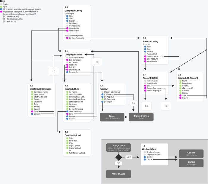
User flows are an under-appreciated tool for ensuring that you understand how your product is discovered, the steps the user must take, the order they can (or must) happen in), and what happens when your user is done. One format I particularly like I call a dot flow map. It's based on a blog post created by AVG's Innovation lab. That post has long-since disappeared, but I luckily archived it in Evernote. The basic principle is that you create a block for each page (or major step in a flow. In each block, you label the pieces of the page as static content, user inputs/interactions, minor actions, or major actions. Sometimes, I create sub-pages for repetitive sections/actions such as a footer.

Wireframes
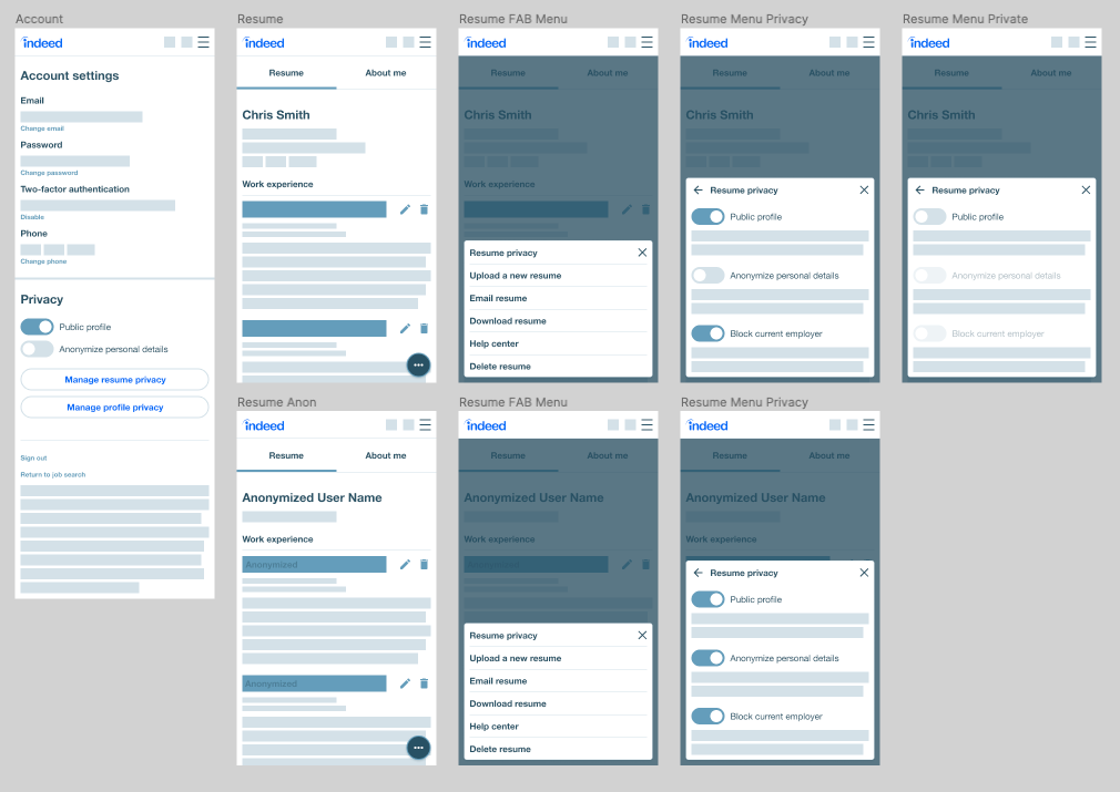
Wireframes aren't just boxes on a page. While they may start as relatively loose blueprints created to illustrate a user flow, it's important that they represent realistic content and functionality as much as possible. At higher fidelities, they become a visual document that allows for developers to begin work while visual design is still underway, as we've defined the types and order of actions that may happen. Today, I admit that I struggle with the need for both high fidelity designs AND wireframes, as we have a fairly mature design system which simplifies many visual design choices.

Prototypes
I try to present all work as a prototype.
Move beyond Invision and similar static slideshows. They're so limited in terms of their ability to make a prototype feel 'real' that I don't think you gain anything for the cost. Figma and Adobe XD are far superior for prototyping, even though you're still essentially faking most data and interactions. While I've enjoyed Principal and Flinto for animation-heavy prototypes, I find myself rarely opening them nowadays. If I found myself needing more fidelity than is possible with Figma, I'll look into Framer. It's the most powerful of the standalone tools today. But I'll also be strongly considering protoyping via a simple web app, particilarly for the tools work I find myself doing now where the complexity isn't in the UI transitions, it's in the ability for users to input data, parse results, and make decisions.
Heuristics
At major milestones, use a heuristic evaluation to surface likely problems with your work. Make it a regular, informal, and fast part of your process. I like this Nielsen Norman Group list.
Critique
Go read Dicussing Design. The abiltiy to critique is a skill that is missing in many groups. Too many designers are unwilling to share their work because of past bad experiences with abuse-disguised-as-critique, loudest-opinion-wins shouting, or environments where only the boss's opinion matters. I'll also blame, somewhat, the proliferation of design thinking-focused processes where expert opinion is downplayed. Experts are capable of being wrong, but they are also capable of drawing on insight and experience to save time and effort, and allow us to our valuable and limited user-time focusing on unique and difficult problems.
Even simple steps can improve critique culture. I like a weekly meeting with signups for 20-30 minute slots. Each presenting designer is expected to share context (who, what, when, where, why and how) using a standard format, as well as presenting where they are in the design process so that the group is able to give meaningful feedback. Here's a document I used at eBay, and another I used at Indeed. It's important that there's someone in the room to facilitate feedback – ensuring that all voices are heard, not just the loudest or most senior voice. There's so much more here - strategies for managing feedback, knowing when to escalate a problematic project, and more. So please, read the book.
User feedback
Put your work in front of users in the highest fidelity possible. If you can get one-on-one time with your users, Usertesting.com and there competitors are perfectly viable for many tasks, particularly simple usability tests. When I'm working with researchers who will be hands-on, I work to provide a rough outline and key questions as a start point. Other times, I am creating my own testing protocols, particularly for more focused usability testing. The key to efficient user research to to create a usable, searchable library - research has a lifespan, yet if there's no way to search an archive, we'll find ourselves asking the same questions and repeating the same mistakes.
Developer handoff
Hopefully this isn't the first time the developer is seeing the designs. I prefer automatically generated specs like Invision Inspect, Figma, or Zeplin to manually annotating files, but these are rarely enough on their own. Discuss expectations ahead of time with your developer(s) and communicate in their language. If you're working in a design system, use the right component and CSS variable names. If you're diving into the CSS - use the right property names and values. As a part of my work at Amazon on the Selling Partner design system, I'm building a standardized annotation library to call out interaction details, component names, accessibility notes, and anything else not captured in the automatic spec generation.
Release Planning
How will your users encounter this and when? You can't go to the validation stage without know if it'll be an opt-in beta, blind A/B test, or something else. What are the cases for a full release or a rollback? Are there any safety levers to pull if things go wrong? Be honest about how this need to be seen by users and what the risks are. The reality is most users hate sudden changes to their experience, and we're not going to make friends with them by suddenly changing a tool that they use to run their business. Both Jared Spool and Christina Wodtke have written about this.
Conclusion
Those are a lot of words for something that, as I said at the beginning, probably won't be directly usable for you. But we have to take some time to think about how we work, and just as importantly WHY we work, so that maybe we can find a better way.
